Data visualization plays a crucial role in uncovering insights and communicating findings effectively. Not all data points are created equal, some points may represent outliers or significant values that require special attention. As a result, it’s often important to highlight specific data points that meet certain conditions.
In this post, I’ll demonstrate how to tag or label specific data points in your visualizations using the powerful tools from the tidyverse. With the help of ggplot2 and ggrepel, we’ll create plots that highlight important data points while keeping the visualization clean and readable.
Let’s start by creating a simple dataset with a few variables. We’ll simulate a dataset of 50 individuals with the following features:
Temperature: Body temperature (°C), normally distributed around 37°C.
Weight: Weight (kg), normally distributed with a mean of 70 kg.
Height: Height (cm), normally distributed around 170 cm.
Exercise: Hours of exercise per week, generated using a Poisson distribution.
Now, let’s establish specific tagging criteria to exclude certain points from the dataset. We aim to remove any participant who meets at least one of the following conditions:
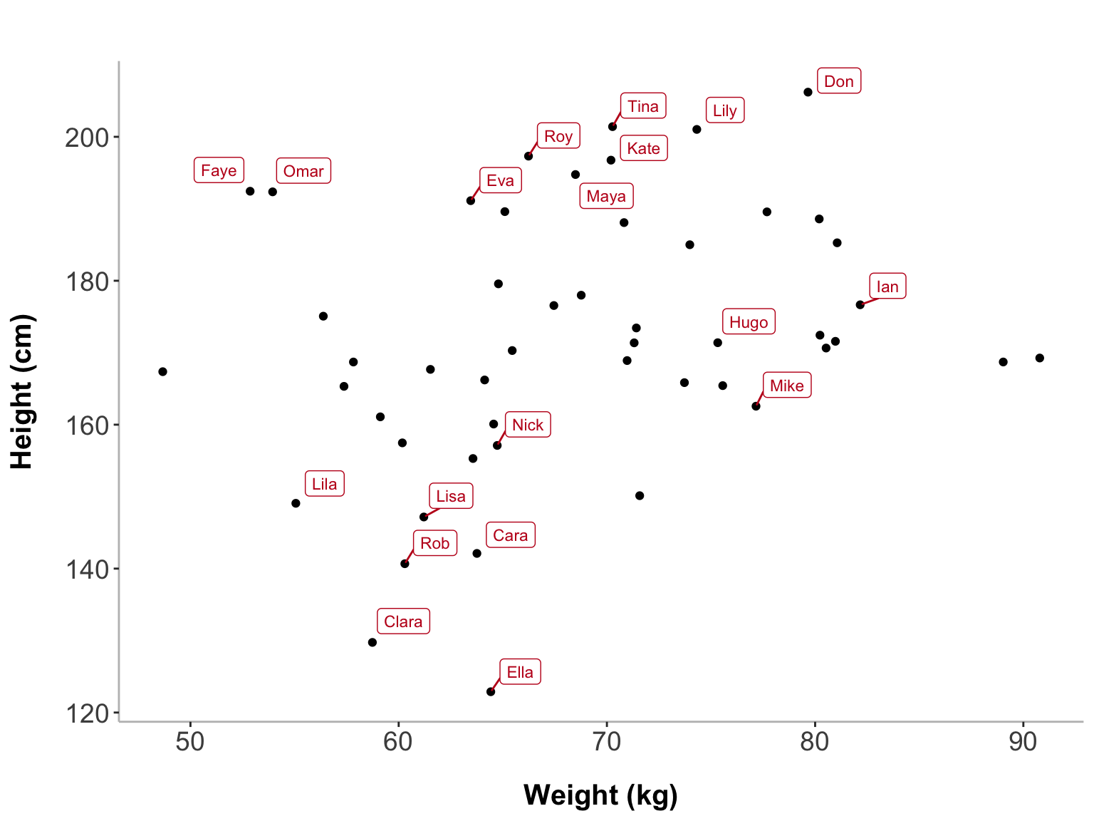
Now that we have tagged specific data points based on our conditions, we can visualize them. We will first show all participants who meet any of the tagging conditions - either they have a temperature above 38°C, a weight above 100 kg, or a height outside the normal range (below 150 cm or above 190 cm). We’ll create a scatter plot of weight vs. height and use ggrepel to label the participants who meet at least one of these conditions. ggrepel ensures that the labels do not overlap with the points, making the visualization clean and readable.
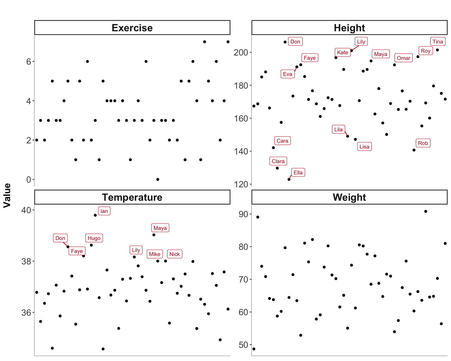
Next, we’ll create a faceted plot where each panel shows one of the three variables: temperature, weight, or height. Participants who meet the specific tagging criteria for that variable will be labeled in the plot. This is useful to examine the distribution of tags for each variable separately.
data<-data%>%mutate(remove =if_else(Temperature>38|Weight>100|Height<150|Height>190, 1, 0))data_long<-data%>%select(-remove)%>%pivot_longer(cols =-Record_id, names_to ="variable", values_to ="value")# Define the filtering conditions for tagging the ids based on the specific variabledata_long<-data_long%>%mutate(tag =case_when(variable=="Temperature"&value>38~TRUE,variable=="Weight"&value>100~TRUE,variable%in%c("Height")&(value<150|value>190)~TRUE,TRUE~FALSE))# Plot for each variable, tagging ids based on specific conditionsggplot(data_long, aes(x =Record_id, y =value))+geom_point()+facet_wrap(~variable, scales ="free_y")+ggrepel::geom_label_repel( data =filter(data_long, tag==TRUE),aes(label =Record_id), size =3, nudge_x =0.15, nudge_y =0.15, color ="#c1121f")+labs(title =" ", x ="ID", y ="Value")+theme_classic()+theme( axis.title.x =element_blank(), axis.text.x =element_blank(), axis.ticks.x =element_blank(), axis.title.y =element_text(size =15, margin =margin(r =15), face ="bold"), axis.text =element_text(size =14), plot.title =element_text(hjust =0.5, size =18, margin =margin(b =10)), panel.border =element_blank(), axis.line =element_line(color ="grey", linewidth =0.5), strip.text =element_text(size =16, face ="bold"))
I hope you enjoyed it. Feel free to leave a comment below!