library(hexSticker)
library(ggplot2)
library(magick)Making Hex Stickers in R
R
Data Visualization
Design
Hex stickers have become a visual signature of the R ecosystem, appearing on packages and representing projects, labs, and areas of research.
I have always liked the idea that something as technical as a research method can be turned into a small piece of visual identity. In this post, I will show how to create a few hex stickers in R using the hexSticker package. The basic idea is to create a graphic, preferably with a transparent background, and pass it to sticker() along with the text, colors, and positioning you want.
A hex sticker has only a few elements to worry about. h_fill and h_color control the hexagon’s fill and border, while h_size controls the border thickness. The graphic placed inside the sticker is controlled through arguments such as s_x, s_y, s_width, and s_height. The package name or title is controlled by package, with p_x, p_y, p_size, p_color, and p_family controlling its appearance. You can also add a URL along the bottom with url. The sticker() function has many more options for controlling the appearance and layout of a sticker. You can read more about them in the hexSticker documentation.
My first sticker is for anthropoR, a small R package I wrote for computing BMI and classifying obesity. I already have a bmi_gauge.png graphic, which is a transparent, color coded arc that runs from low to high with a needle indicating the measurement. I’ll place this graphic inside the hexagon.
img <- image_read("bmi_gauge.png")

s1 <- sticker(
  img,
  package  = "anthropoR",
  p_size   = 12, p_y = 0.65, p_color = "white",
  s_x = 1, s_y = 1.15, s_width = 5.8, s_height = 1.5,
  h_fill   = "#e63946",
  h_color  = "#7a1420",
  h_size   = 1.5,
  u_size   = 3.2, u_color = "white"
)

print(s1)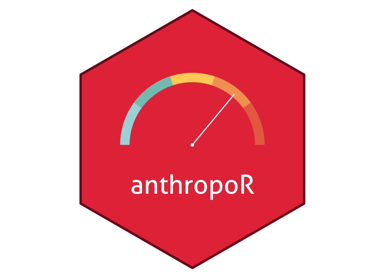
The next sticker represents missing data and imputation with a simple grid of data cells, some filled and others empty with dashed outlines to convey incomplete data.
set.seed(3)
grid <- expand.grid(row = 1:4, col = 1:4)
grid$missing <- runif(nrow(grid)) < 0.28

cells <- ggplot(grid, aes(col, -row)) +
  geom_tile(data = subset(grid, !missing),
            fill = "white", width = 0.8, height = 0.8) +
  geom_tile(data = subset(grid, missing),
            fill = NA, color = "#ffd166", linewidth = 0.8,
            linetype = "dashed", width = 0.8, height = 0.8) +
  theme_void() + theme_transparent()

s2 <- sticker(
  cells,
  package  = "imputation",
  p_size   = 13, p_y = 0.45, p_color = "white",
  s_x = 1, s_y = 1.05, s_width = 1.1, s_height = 1.1,
  h_fill   = "#8338ec",
  h_color  = "#4a1d8a",
  h_size   = 1.5
)

print(s2)
The last sticker uses the three curves from an SIR model for susceptible, infected, and recovered individuals over the course of an epidemic. I use a simulation from the deSolve package, so the epidemic shape shows a real model simulation.
library(deSolve)
library(tidyr)

sir <- function(time, state, parms) {
  with(as.list(c(state, parms)), {
    dS <- -beta * S * I
    dI <-  beta * S * I - gamma * I
    dR <-  gamma * I
    list(c(dS, dI, dR))
  })
}

out <- as.data.frame(ode(c(S = 0.99, I = 0.01, R = 0),
                         seq(0, 60, by = 1), sir,
                         c(beta = 0.4, gamma = 0.1)))
out_long <- pivot_longer(out, cols = c(S, I, R),
                         names_to = "compartment", values_to = "value")

curves <- ggplot(out_long, aes(time, value, color = compartment)) +
  geom_line(linewidth = 1.1) +
  scale_color_manual(values = c(S = "#e9f5f3", I = "#e76f51", R = "#ffd166")) +
  theme_void() + theme_transparent() +
  theme(legend.position = "none")

s3 <- sticker(
  curves,
  package  = "SIRsimR",
  p_size   = 12, p_y = 0.5, p_color = "white",
  s_x = 1, s_y = 1.05, s_width = 1.5, s_height = 0.95,
  h_fill   = "#2a9d8f",
  h_color  = "#1b5e57",
  h_size   = 1.5,
)

print(s3)
Hex stickers are a simple way to give a package or research project a recognizable visual identity. With hexSticker, you can take a graphic you already have, place it inside a hexagon, and customize the colors, and layout entirely in R. The examples here are just starting points; the same workflow can be adapted to almost any concept you want to turn into a sticker.